
Better UX materially changes whether patients follow through. Across peer-reviewed trials, pilot studies, and network meta-analyses, the pattern holds: when digital health tools reduce friction, clarify next steps, and deliver timely feedback, adherence improves. The mechanisms are not mysterious. Patients abandon tools that feel slow, confusing, or irrelevant to their actual routines, and they stick with tools that fit naturally into daily life.
Three pieces of evidence anchor this claim:
- The WHO estimates that adherence to long-term therapies in developed countries averages around 50%, meaning the gap between prescribed and actual behavior is enormous and addressable.
- A network meta-analysis found that multicomponent interventions combining technical, educational, and attitudinal elements sustained adherence better over time than any single-component approach, with technical components performing consistently well across follow-up windows.
- A Czech pilot study of an mHealth app for older adults with chronic heart failure and COPD found qualitative satisfaction but also revealed that technical reliability problems can confound any UX–adherence link, making robust engineering as important as interface design.
Three actions your team can take right now:
- Run a 30-minute think-aloud usability session with five patients using your current tool. You will surface the top friction points faster than any analytics dashboard.
- Pick one objective adherence metric (medication initiation rate, daily check-in completion, or device sync frequency) and establish a baseline before any design change.
- Identify the single highest-friction step in your onboarding flow and prototype one alternative. Ship it to a small cohort and measure the metric you just baselined.
Table of Contents
- How UX actually drives adherence: the causal pathways
- What the empirical evidence actually shows
- Design principles that actually move the adherence needle
- How to measure UX's impact on adherence
- Running a UX pilot to improve adherence: who does what
- Barriers, equity concerns, and U.S. privacy considerations
- Key Takeaways
- The gap between what "good UX" promises and what actually matters
- Uvirello's Smart Scale as a daily adherence touchpoint
- Useful sources to read next
How UX actually drives adherence: the causal pathways
The role of user experience in health adherence is not a single mechanism. It operates through at least five distinct causal pathways, each of which maps to a design lever your team can pull.
Friction reduction. Every extra tap, login prompt, or confusing label adds cognitive cost. When that cost exceeds the perceived benefit of completing a task, patients stop. Reducing time-on-task and error rates directly lowers the threshold for consistent use. Quick, low-effort health check workflows are one practical expression of this principle.
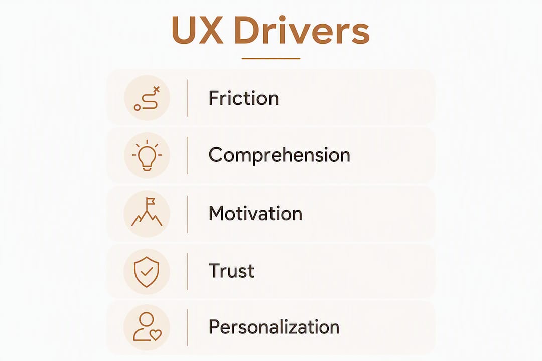
Comprehension and cognitive load. Patients managing chronic conditions often juggle multiple medications, devices, and care instructions simultaneously. Tools that present information in plain language, use progressive disclosure, and chunk tasks into single steps reduce the mental work required. Lower cognitive load correlates with higher task completion.
Motivation and feedback loops. Timely, specific feedback, such as a progress bar, a streak counter, or a graph showing a week's readings, sustains motivation between clinical visits. Health tracking that motivates behavior change works precisely because it closes the feedback loop that clinical encounters leave open for days or weeks.

Trust and credibility signals. Patients and clinicians both need to trust a tool before they rely on it. Visual design quality, data accuracy, transparent data handling, and visible clinical endorsement all function as trust signals. Research on healthcare UX frameworks identifies credibility and perceived value as two of the six dimensions that sustain engagement over time.
Personalization and habit formation. A tool that adapts to a patient's schedule, language, and condition-specific needs feels relevant rather than generic. Relevance drives repeated use, and repeated use builds habit. The consumerization of healthcare has raised patient expectations sharply: people now compare health apps against Netflix and Amazon, and tools that fall short of that standard create an experience gap that erodes adherence.

A simple causal chain your team can use when scoping design changes: UX change → immediate user effect (less friction, clearer comprehension, stronger motivation) → adherence behavior (initiation, implementation, persistence) → clinical outcome. Map every proposed feature to at least one step in that chain. If you cannot, the feature is probably not worth the complexity it adds.
Pro Tip: During field studies, watch for "invisible work" — the informal workarounds patients create to make a tool fit their routine (a sticky note on the bathroom mirror, a phone alarm labeled with a medication name, a caregiver who logs in on the patient's behalf). These adaptations signal where the designed workflow breaks down. Address the root cause, and you eliminate the workaround and the cognitive overhead it carries.
What the empirical evidence actually shows
The evidence base for UX's impact on adherence is real but uneven. Here is what the data supports and where it falls short.
What holds up across studies:
- Multicomponent interventions that include a technical element (an app, a connected device, electronic monitoring) consistently outperform single-component approaches in sustaining adherence over longer follow-ups, per the network meta-analysis cited above.
- Providing patients with visual feedback from electronically monitored medication events tends to improve adherence compared with no feedback. An umbrella review of community adherence interventions found that certain trials reported approximately 10 percentage-point absolute improvements when adherence feedback was added.
- Behavioral design methods applied during development, such as those used in building the Abily digital health app, reported measurable increases in patient attention and task comprehension, with promising adherence-related signals in pilot evaluations.
Key finding: A systematic review and meta-analysis across 53 studies of multilevel interventions in older adults found that digital tools improved adherence in some contexts, but pooled effects showed high heterogeneity and very low GRADE certainty, meaning effect sizes varied widely and confidence in any single estimate is limited.
Where the evidence is weaker:
The Czech pilot study (n=41) of an mHealth app for older adults with chronic heart failure and COPD found user satisfaction but no statistically significant correlation between SUS or UEQ scores and adherence change. Technical problems, including connectivity failures and app crashes, likely confounded the results. This is a recurring pattern: UX quality cannot compensate for unreliable infrastructure.
Short follow-up windows are another persistent limitation. Many trials measure adherence over 4–12 weeks. Chronic disease management requires sustained behavior over months and years, and most studies simply do not track that far. Population heterogeneity compounds the problem: an intervention that works well for a 35-year-old with a smartphone and broadband may perform poorly for a 72-year-old with low digital literacy and a shared tablet.
The practical takeaway is not that UX does not matter. It is that UX improvements need to be measured with objective adherence metrics, not just satisfaction scores, and that technical reliability is a prerequisite, not an afterthought.
Design principles that actually move the adherence needle
Evidence and mechanisms are useful, but product teams need something they can act on in a sprint. The principles below translate the research into concrete design decisions.
Core principles
- Simplify ruthlessly. Every screen should have one primary action. Remove optional features from the critical path. Patients in pain or under stress will not hunt for a button.
- Make intent and next steps visible. Use progress indicators, clear labels, and contextual prompts. Patients should never have to guess what to do next or why.
- Deliver feedback at the moment of action. Confirmation messages, progress updates, and streak notifications work best when they appear immediately after the relevant behavior, not in a weekly digest email.
- Personalize schedules and content. Allow patients to set their own reminder times, choose their preferred language, and see condition-specific information. A stable core workflow with configurable interfaces is the pragmatic solution to the tension between standardization (needed for security and integration) and personalization (needed for relevance).
- Design for low digital literacy and accessibility. Use plain language at a sixth-grade reading level for patient-facing content. Support screen readers, high-contrast modes, and large tap targets. Age-tailored digital tools and caregiver-inclusive workflows improve outcomes in older populations specifically.
- Show credible clinical signals. Display the name or affiliation of the clinical team, use recognized health iconography, and be transparent about data use. Credibility is a design element, not just a legal requirement.
- Integrate with clinician workflows. A tool that generates data clinicians cannot access or act on will lose clinician endorsement quickly, and clinician endorsement is one of the strongest drivers of patient adoption.
Do/don't table
| Design choice | Do | Don't |
|---|---|---|
| Onboarding length | Limit to 3 steps; defer optional setup | Force full profile completion before first use |
| Notifications | Let patients set timing and frequency | Send fixed-schedule alerts regardless of routine |
| Data display | Show trends in plain-language summaries | Display raw data tables without interpretation |
| Error messages | Explain what went wrong and what to do next | Show generic error codes or silent failures |
| Accessibility | Test with screen readers and low-vision users | Assume all users have standard vision and dexterity |
| Clinical credibility | Display care team name and last sync date | Omit any reference to the clinical context |
| Feedback timing | Trigger confirmation immediately after task | Batch feedback into end-of-day summaries only |
Pro Tip: When collaborating with clinicians on design, bring a clickable prototype to the first meeting rather than a feature list. Clinicians respond to concrete workflows, and a prototype surfaces integration conflicts in 20 minutes that a requirements document would miss for weeks.
Checklist by sprint milestone:
- Discovery: Conduct think-aloud sessions with 5 patients; interview 2–3 clinicians about workflow integration points; establish baseline adherence metric.
- Prototype: Test navigation with low-fidelity wireframes; validate notification timing preferences; confirm accessibility with at least one assistive-technology user.
- Pilot: Deploy to a cohort of 20–50 patients; collect objective adherence data alongside SUS scores; run a mid-pilot check-in at week 4.
- Scale: Analyze qualitative feedback for workarounds; iterate on the top two friction points before wider rollout; set up continuous monitoring of the adherence metric.
How to measure UX's impact on adherence
Measuring the impact of user design on health outcomes requires two parallel tracks: UX metrics and adherence metrics. Conflating them, or measuring only one, produces misleading conclusions.
- System Usability Scale (SUS). A 10-item questionnaire that produces a 0–100 score. Fast to administer, widely benchmarked, and sensitive enough to detect meaningful usability differences between versions. A score above 68 is generally considered above average.
- Task completion rate and time on task. Measured during usability sessions. These are the most direct indicators of friction. A task that takes three times longer than expected, or that 40% of participants fail to complete, is a design problem regardless of what the SUS says.
- User Experience Questionnaire (UEQ). Covers attractiveness, perspicuity, efficiency, dependability, stimulation, and novelty. More granular than SUS and useful for identifying which dimension of UX is underperforming.
- Error rate and recovery time. How often do patients make mistakes, and how long does it take them to recover? High error rates in critical flows (medication logging, appointment scheduling) directly predict abandonment.
- Medication adherence: initiation, implementation, persistence. These three phases, defined by the ABC taxonomy, map to distinct UX problems. Initiation failures often reflect onboarding friction. Implementation failures reflect daily-use friction. Persistence failures reflect motivation decay or perceived irrelevance.
- Objective adherence measures. Electronic medication event monitoring (MEMS caps, smart pill dispensers), pharmacy refill records, and device sync logs are more reliable than self-report. Where possible, triangulate self-report with at least one objective measure.
- Engagement metrics. Daily active users, session length, feature adoption rates, and notification response rates are leading indicators of adherence. A drop in engagement typically precedes a drop in adherence by days to weeks.
Study design note: Think-aloud usability testing combined with open-ended post-task interviews and clinician participation uncovers both usability failures and condition-specific workflow mismatches that small lab tests miss. Mixed methods are not optional in health UX research; they are how you find the problems that quantitative data alone cannot explain.
Measurement pitfalls to avoid:
- Hawthorne effects. Patients who know they are being observed tend to behave more carefully. Use passive data collection (device logs, pharmacy records) alongside observed sessions to cross-check.
- Satisfaction ≠ adherence. The Czech pilot study is a clear example: patients reported satisfaction with the app while adherence data showed no significant improvement. Always measure both.
- Short follow-up bias. A 4-week pilot may show strong engagement that collapses at week 8. Build in at least one follow-up measurement at 3 months for any intervention intended to support chronic disease management.
- Attribution errors. If you change the UX and adherence improves, confirm that no other variable changed simultaneously (new clinician, seasonal effect, concurrent intervention).
Running a UX pilot to improve adherence: who does what
A well-structured pilot does not require a large team or a long timeline. It requires clear roles, defined success criteria, and a commitment to collecting objective data.
Recommended timeline:
- Weeks 1–3 (Discovery): Recruit patient participants; conduct think-aloud sessions and clinician interviews; establish baseline adherence metric; document current-state workflow.
- Weeks 4–6 (Prototype testing): Build low-to-mid fidelity prototype of the target UX change; run 5–8 usability sessions; iterate on critical failures.
- Weeks 7–14 (Small-scale pilot): Deploy to 20–50 patients; collect SUS, task completion, and objective adherence data weekly; run a mid-pilot qualitative check-in at week 10.
- Weeks 15–16 (Analysis and decision): Analyze quantitative and qualitative data; compare adherence metric against baseline; decide to iterate, scale, or discontinue.
Roles and responsibilities:
| Role | Primary responsibility |
|---|---|
| UX researcher | Usability sessions, interview analysis, synthesis |
| Clinician partner | Workflow validation, patient recruitment, clinical context |
| Product manager | Timeline, success criteria, stakeholder communication |
| Data analyst | Adherence metric tracking, statistical analysis |
| Privacy/compliance reviewer | HIPAA alignment, consent documentation, data handling |
| Patient representatives | Co-design input, feedback on prototype realism |
Success criteria for a pilot:
- Primary: statistically meaningful improvement (or a pre-specified minimum detectable effect) in the chosen objective adherence metric versus baseline.
- Secondary: SUS score above 68; task completion rate above 80% on critical flows; no increase in error rate.
- Qualitative: no new workarounds identified in mid-pilot interviews; clinician partner reports no workflow disruption.
For sample size, a rough heuristic for usability testing is 5 participants per distinct user group to surface the majority of critical usability problems. For adherence measurement, consult a statistician early: effect sizes in this domain vary enough that underpowered pilots routinely produce inconclusive results. Integrating device data and clinician dashboards into the pilot infrastructure from the start reduces the data-collection burden at analysis.
Barriers, equity concerns, and U.S. privacy considerations
A well-designed tool that only works for patients with high digital literacy, reliable broadband, and a recent smartphone is not a well-designed tool. It is a tool that widens health disparities.
Common barriers your team needs to plan for:
- Digital literacy. Many patients, particularly older adults and those with lower educational attainment, struggle with standard smartphone interfaces. Plain-language content, larger tap targets, and simplified navigation are not optional extras.
- Device and connectivity access. Not every patient owns a smartphone or has reliable home broadband. Offline functionality, SMS-based fallbacks, and subsidized device programs address this directly.
- Language and health literacy. English-only interfaces exclude a significant share of U.S. patients. Multilingual support and plain-language content (aim for a sixth-grade reading level) are baseline requirements for equitable deployment.
- Cost. Subscription fees or device costs create access barriers. Consider whether your program can absorb device costs for lower-income participants or integrate with existing subsidized programs.
- Clinician workflow friction. If using the tool adds time to a clinical encounter without clear benefit, clinicians will stop recommending it. Design for minimal workflow disruption and visible clinical value.
- Caregiver exclusion. Many patients, especially older adults, rely on caregivers to manage medications and appointments. Tools that do not support caregiver access modes lose a critical support layer.
Mitigation steps:
- Conduct usability testing with participants who represent the lower end of your digital literacy range, not just tech-comfortable early adopters.
- Offer caregiver-linked accounts with appropriate permission scoping.
- Provide an offline or low-bandwidth mode for core adherence functions.
- Use plain-language content review as a standard step in the content production workflow.
- Train clinicians on the tool before patient rollout; their confidence directly affects patient adoption.
U.S. privacy and regulatory considerations:
Any digital health tool that handles protected health information (PHI) in the U.S. must comply with HIPAA. In practice, this means: data encryption in transit and at rest, minimum necessary data collection, documented consent processes, and a Business Associate Agreement with any third-party vendor handling PHI. For pilot studies, IRB review is typically required when collecting identifiable health data for research purposes. Data privacy in health tracking covers practical HIPAA considerations for U.S. teams in more detail.
Pro Tip: Build your consent language with a plain-language specialist, not just legal counsel. Patients who understand what data is collected and why are more likely to trust the tool and less likely to withdraw from a pilot. Consent is a UX problem as much as a legal one.
Key Takeaways
Well-designed UX reduces friction, builds trust, and sustains the repeated behaviors that adherence requires, but only when paired with technical reliability, objective measurement, and inclusive design from the start.
| Point | Details |
|---|---|
| Multicomponent design wins | Combining technical, educational, and attitudinal elements sustains adherence better than any single-component approach. |
| Measure adherence, not just satisfaction | SUS scores and user satisfaction can be high while objective adherence remains unchanged; always track both. |
| Technical reliability is a prerequisite | UX improvements cannot compensate for app crashes or connectivity failures; fix infrastructure before optimizing interface. |
| Equity requires deliberate design | Digital literacy, language, device access, and caregiver workflows must be addressed explicitly, not assumed away. |
| Uvirello as a daily feedback tool | Uvirello's Smart Electronic Weight Scale provides the kind of timely, low-friction body composition feedback that supports consistent health tracking habits. |
The gap between what "good UX" promises and what actually matters
There is a version of the UX-for-adherence conversation that stays entirely at the surface: better colors, smoother animations, a friendlier onboarding flow. That version is not wrong, but it misses the harder problem.
The research keeps returning to the same uncomfortable finding: patients do not abandon health tools because the interface is ugly. They abandon them because the tool does not fit their life. A medication reminder that fires at 8 AM is useless to a night-shift nurse. A weight-tracking app that requires a stable Wi-Fi connection fails the patient in a rural area. A diabetes management platform that shows data in clinical units without explanation loses the patient who never finished high school.
The "consumerization of healthcare" framing is useful up to a point. Yes, patients expect the polish of consumer apps. But Netflix does not ask you to log symptoms while you are in pain, and Amazon does not require you to remember a medication schedule. The stakes and the cognitive context are different, and designing as if they are not is a category error.
What actually moves adherence is not polish. It is fit: the degree to which a tool slots into a patient's existing routine without demanding that they reorganize their life around it. That requires field research, not just lab usability testing. It requires clinician partnership, not just clinical sign-off. And it requires a willingness to measure objective adherence outcomes rather than stopping at satisfaction scores.
The teams that get this right tend to share one habit: they spend more time watching patients use the tool in real environments than they spend debating feature priorities in a conference room.
Uvirello's Smart Scale as a daily adherence touchpoint
Most adherence programs focus on medication and clinical appointments. The daily feedback loop between those touchpoints is where behavior either holds or breaks down.
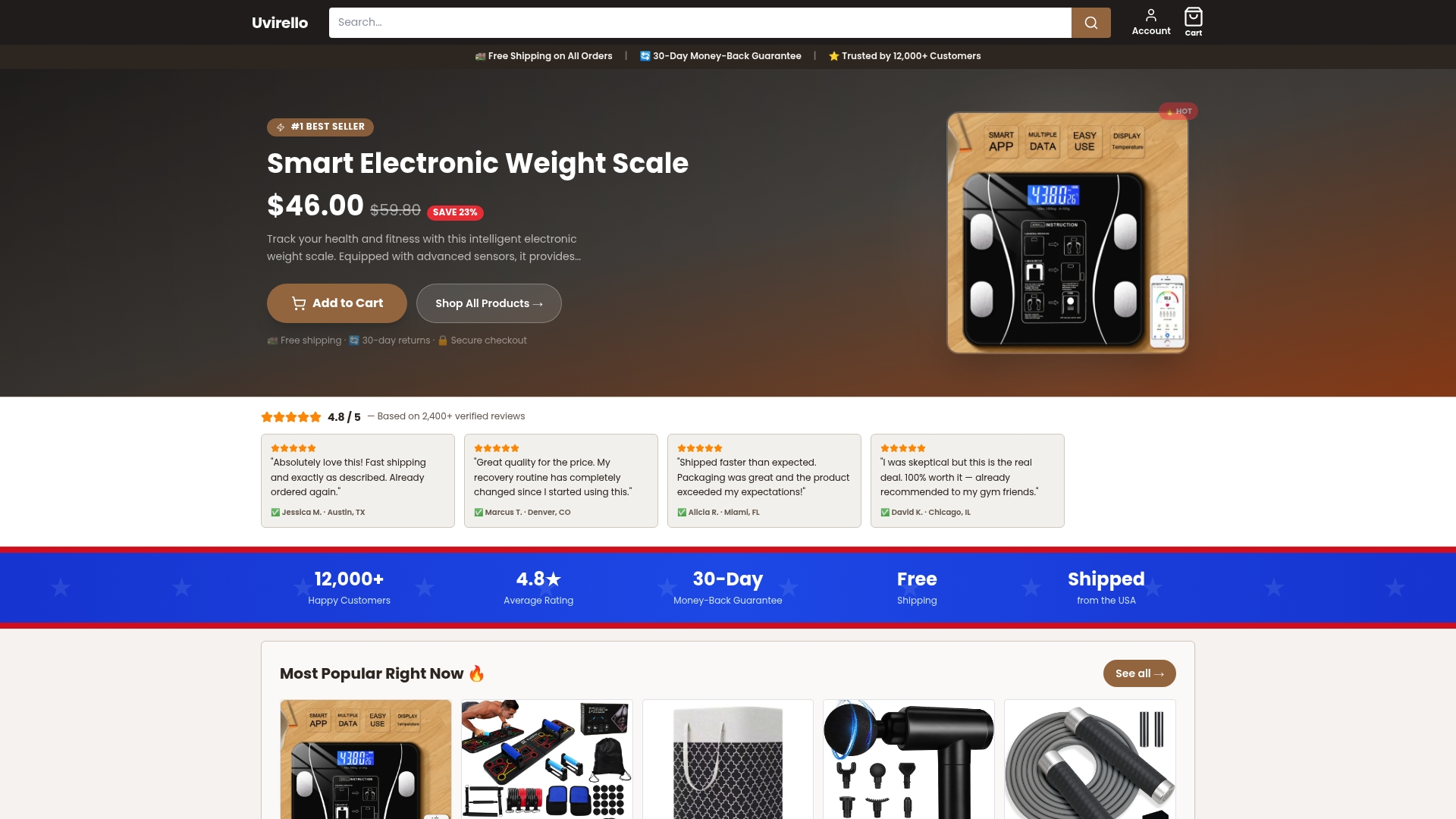
The Uvirello Smart Electronic Weight Scale addresses that gap directly. With high-precision sensors delivering body fat percentage, BMI, and additional body composition metrics in seconds, it gives patients a concrete, low-effort data point every morning, without a clinical visit, without a login, and without a lengthy workflow. Over 12,000 customers rate it 4.8 out of 5, which reflects the kind of trust that comes from a device that simply works, consistently.
For clinical and product teams, the integration angle is worth considering. Body composition data from a connected scale can feed adherence reminders, populate clinician dashboards, or serve as a behavioral anchor for patients in weight management or cardiovascular programs. The device's user-friendly design keeps the friction low enough that daily use becomes habitual rather than effortful. IoT-enabled personal health tracking explains how connected devices like this fit into broader adherence architectures.
Uvirello is not a clinical device and is not intended to replace medical monitoring. Teams evaluating it for adherence support programs should confirm fit with their specific clinical context. To review specifications and explore whether it suits your program, visit uvirello.com.
Useful sources to read next
-
Patients' UX Impact on Medication Adherence in Czech Pilot Study for Chronically Ill — A pilot study (n=41) examining SUS and UEQ scores against adherence outcomes in older adults with chronic conditions; valuable for understanding the limits of satisfaction-based UX measurement and the role of technical reliability.
-
Temporal Effectiveness of Interventions to Improve Medication Adherence: A Network Meta-Analysis — The strongest available evidence that multicomponent interventions (technical + educational + attitudinal) outperform single-component approaches over time; essential reading for anyone designing a pilot.
-
Multilevel Interventions to Improve Medication Adherence in Older Adults: A Systematic Review and Meta-Analysis — Covers 53 studies; useful for understanding population-specific effects, caregiver roles, and the high heterogeneity that limits generalizability.
-
Think-Aloud Usability Testing in Healthcare Contexts — Best-practices guidance on combining think-aloud protocols with post-task interviews and clinician participation; the most practical methods reference in this list.
-
Consumerization and Patient Expectations in Digital Health — Describes the experience gap created when health tools fail to meet consumer-app expectations; useful framing for stakeholder conversations about design investment.
-
Optimizing Healthcare UX: Framework Linking Usability, Value, and Engagement — Proposes a six-dimension framework (usable, useful, findable, accessible, credible, desirable) as a practical design objective checklist.
-
Improving Medication Adherence in the Community: A Purposive Umbrella Review — Synthesizes evidence on feedback-based interventions; the source for the approximately 10 percentage-point improvement finding cited in the evidence section.
-
Digital Patient Experience: Umbrella Systematic Review — Broad review of how digital health affects patient experience; useful background for teams building the conceptual case for UX investment with clinical stakeholders.